Monday, May 4, 2009

C'est La Fin!

The journey has come to an end.
My website is complete, finished and ready for viewing (best at 1680 X 1050)!

Jaime Barnett Photography

After many hours of designing, creating, tweaking, redoing, slicing, coding and at times nearly crying I have to say every last bit of work put into it was worth it. Although I still feel that there are some small things that could be changed (size, minor details, etc) it was a great learning process. Creating this website really was the final culmination of everything we learned in this class through out the semester, it forced me to design...and use the design elements we discussed many times over. It demanded polishing my Photoshop skills and allowed me to practice those design skills through typography, photography and the use of color. The most difficult part of this process occurred when it finally came time to open up Dreamweaver and actually build the website. I realized I had no idea what to do beyond the few notes I had written down from class. After hours of reading tutorials I finally found a youtube video that was precisely what we were doing and essentially saved my life...and website. This guided me through coding and uploading my site step by step and by the third page in I was able to actually understand what I was doing. By choosing this project I feel satsified in knowing I truly have learned something and even plan on doing another website more elaborately in the future. Although I didn't change exactly everything that we discussed during our critique I appreciated the feedback and think it's vital to any course of design action. It helped me understand how people were perceiving what I was projecting and basically guided me in the right direction. I hope everyone else has enjoyed this class (and at times it's frustrations) as much as I have, I certainly feel like I'm coming away with a better understanding of technology...in art education.

Sunday, May 3, 2009

It is a L A T E update.

For my second and extremely late update on the progress of my website I have one main point to hit. The biggest obstacle I was running into at this stage of the game was how to design my portfolio page. I found that most personal portfolio sites have a link to an index of images which is how I started designing mine as well.


Originally I had planned to create an index in the same style as my main pages, using the twelve images in my portfolio only smaller and with a gold frame around each thumbnail. From there, you could click on a thumbnail which would make it bigger and bring you to individual pages which look like this:

But because I wanted you to be able to click "back" and "next" to navigate through the images, it didn't make sense to have an entire page of thumbnails. Sometimes when I am looking at someone's work I don't grasp the entire content because I instead choose which images I want to look at via their index page. I feel that when putting together a body of work it is important in determining the order and flow of images, it's not random images thrown together. As this process evolved I concluded that by allowing the user to have to click through each page they would be forced to see the entire portfolio. In conclusion, my final navigation page is as follows:


By clicking portfolio from any navigation bar or from the main page it will take you here. From here you can then click "enter portfolio" which will take you through each image with the option of going to the next image or back to the main page. I think this setup will be much more appropriate for my work.

It is a L A T E ad critique.

The World Wildlife Foundation has found a niche in their advertising, which I believe cleverness holds the foundation for. Many of their ads, which are simply quick reminders to think about the earth, have a creative, playful feel while dictating an extremely important message. I wanted to share a few of their advertisements to show the cohesion that all of their ads possess and the overall concept that is communicated quite clearly.


"Give a hand to wildlife."


"15km of rainforest disappears every minute."


Their ads even have a similar color scheme, they are easily recognizable with big bold subjects and invoke thought about what is meant by their ad.

"Before it's too late."

Of the few I found to review, I believe this advertisement has the most impact for many reasons. Again, it is a simple advertisement (as this seems to be my trend) with a message that could probably be understood with or without the text. Granted these are natural colors that a designer had no intention of changing, but the continued use of a slightly unnatural and almost somewhat desaturated version of these colors connects this visually to their entire campaign. The use of their color-editing stands behind the message that is being sent, it is somber, still looking and meant to cause heavy impact. However, this ad is most effective because of the message being delivered. The trees were designed to resemble lungs that are slowly being deteriorated which is meant to represent the destroying of our earth's rainforests. The ad is designed as lungs with the notion that trees are essential to our environment because they provide oxygen. Overall this particular advertisement is an effort to stop destroying our rainforests and gracefully does so on both an aesthetic and sociological ground. Their small logo and text provides visual identification but does not detract from the ad due to it's size, placement and white color. I believe this ad would work well in print and/or on the web given it's design.

Tuesday, April 21, 2009

It is in the works.


So, in all honesty I have felt a little behind schedule in the making of my website. I say this only because I have been spending nearly an hour a day fooling around with layout, template, design, and colors only to walk away from the computer with nothing solid or complete. However, it (it being the skeleton of this project) finally dawned on me this morning...and it's been progressing ever since! Breakthrough! Most importantly, I have been trying to find a way to incorporate a particular set of frame brushes (since I am creating a photography portfolio), a wallpaper pattern and my images. After doing a few tutorials and reading up on 'how to create a website in Photoshop' I was also able to better understand a few small details that didn't make sense. Each page is being created at 1000x800 at 72 dpi to stay within range of the average size of viewing.

http://www.entheosweb.com/photoshop/layout.asp
http://www.adobetutorialz.com/articles/2967/9/Making-your-own-portfolio-web-page
http://www.freephotoshoptemplates.com/templatesbox/templates/tb017.htm

Here are a few of my alternate attempts:


However, nothing seemed to make sense. As I was going through some of the photographs I plan on using in my portfolio section, I realized that the few I had against black backgrounds may work well AS the layout of my site. Going with this theme, I've decided to create my content on a black background - which additionally is a very successful way of presenting photographs, on black - using the frames as buttons and the wallpaper pattern as filler!


By creating multiple layers I have been able to include my own photograph (for example, at the bottom) and create buttons out of a brush by embossing the layer then adding a fill. While I still am not 100% sure about exact layout of each page, I feel relieved to have a direction and theme to work with.

Sunday, April 19, 2009

It is balanced by negatives and positives.

Woof! Each week when I am looking through illustrations, advertisements, package and product designs to review, I consistently am drawn to the minimalist pieces of work. Those that use wit and not an overabundance of colors, flashy effects or text to send a message or appeal to an audience. I appreciate the outstanding impact that simple design has a tendency to create. I chose this advertisement for a variety of reasons, including the fact that it is fairly successful as a simple design yet how it also is limited by it's vehicle of presentation. This print ad specifically works better in it's medium as opposed to on the web. The identification found in the upper right hand corner is almost lost against the sky. We can probably identify a Febreeze bottle (which is subconsciously branded by it's shape and colors) but the white text is nearly impossible to read unless enlarged dramatically. As a print ad, the scale of the text would be highly recognizable and ease the hurdle of it being small, white text on a light colored background. Granted, this advertisement may not be intended for use on the web, however, I feel like it has the potential to be interchangeable and should be designed with at least the option of being able to read and understand it in alternate forms.
Aside from it's disadvantages (and if we were looking at this in print) I believe it is a humorous, uncomplicated ad that is assisted by the accompanying text. Under the Febreeze bottle the text reads, "Get Your Home Back" which is in response to the suggested dog smell one's home may possess. I think this ad is very comprehensive and explanatory of it's product, trying to get a dog smell out of furniture can be a tough task as I've recently learned. The aesthetics of this ad are not ground breaking but pleasing, a soft color scheme provides attention to the subject and I believe the overall advertisement can be read from left to right. At left - the dog is noticed inside of the house, you may stop for a second to figure out what it means and then as your eye moves to the right side of the page where the product/text sums it all up. All in all it is well done in terms of simplicity with minor design flaws, specifically the color and scale of text. Also, I want that dog.

Tuesday, April 14, 2009

It is Shepard Fairey.


An identifying force during this past presidential election was Shepard Fairey's depiction of Obama on a selection of posters. The most recognizable was that of "HOPE" in the exact same style as the poster in discussion. This simple design quickly became iconic and has since taken off for other campaigns such as adoptapet.com. The redesigned poster featuring a dog and the word "ADOPT" along the bottom is clean, familiar and highly informative without the use of much text. While this design could probably be characterized by any color scheme, using the same theme of red and blue on white/cream reinforces the artist's performance and hopefully creates the same impact upon the audience. This design is so powerful because of it's simple and precise message delivered flawlessly in a 2-d manner. The text along the bottom is almost authoritative and provides a stark message coupled with the softness of the image of the dog. The colors are used in a way that keeps your eye moving and even breaks up the background to allow some depth between the subject and the rest of the space. This evenly spaced, centered image reinforces the sensation that the text provides: strong impact, clear-cut and precise. I fully support this ad and it's message and although I may be biased towards it's cause, the overall impact is essentially achieved as a reworked design.

It is the beginnings of a website.

When sitting down to create something that is essentially a blank canvas, I find it best to scour the web for ideas and inspiration to help me focus my thoughts and ideas in a certain direction. My final project has been narrowed down to creating a portfolio website for my photography, however this still has left me with many open ended details. I have been researching design ideas, tutorials, web resources and the like for the past couple of days and compiled a list which I will share for those stuck in the same position. Luckily it seems as though any one website provides 5 links to similar sites and so on, thus my bookmark folder has been filled up with helpful ideas.
Sometimes my thoughts run together and I end up with a concept similar to this

in my head. So by using minimalist colors and keeping things simple I will be able to create a better portfolio, with design in mind.

Tuesday, April 7, 2009

It is HTML 2.0

Greetings fellow HTMLers!
I'm trekking along the webdesign highway, showering my blog with knowledge gained from this tutorial. Please excuse the scattering of thoughts, there is a purpose I assure you.
Similarly, what is my purpose in life?
  • Raise a million beagle puppies.
  • Own a house with an enormous chandelier above the bathtub.
  • Wear black and brown together at every chance possible.
  • Grow a garden.
(Accomplished so far: raised ONE beagle puppy. Well on my way.)

Meet Bubba, he's a very hungry dog.


The following table provides you with information about all of my current animals: Their name, Kind and Favorite thing ever.


Bubba Beagle Peeling run over french fries off of the road. Near death experiences.
Hattie Golden Retriever Hitting you with her tail.
Maximum Volume Lion Caturday


See Also:


Hattie.


Maximum.

Most days I like them better than people.
Love, Jaime

Monday, April 6, 2009

It is 1969.


The year is 1969, The Rolling Stones are going on tour and David Byrd has designed a concert poster that is adaptable to each city they're playing in. The year is 2009, The Rolling Stones are still going on tour (unbelievable) and we now hang their old advertisements on the wall as a work of art. Why? Aside from collecting rock memorabilia, this particular poster could (and in my opinion, does) stand alone as a beautiful piece of art. It was during this time period that a revival of art nouveau occurred, influencing many of the artists that were designing concert posters of the 60's. For the first time since it's origination by Alfonse Mucha, art nouveau spoke loudly and graphically for rock and roll. As seen here, the most prominent figure is the nude woman surrounded by a design that is a very distinct fashion. Everything is encompassed in some kind of framework and positioned symmetrically throughout the entire piece. The distinction between classical and 60's art nouveau is seen in the use of colors. These concert posters boasted psychedelic, almost acidic and often contrasting colors as opposed to the former shades of earth tones and muted colors. The cool palette of colors dominates the scene with a hint of warm tones to set off the figure. In this instance I think the use of both tones work hand in hand to accentuate and define the piece without being the slightest bit distracting. The influence of nature that is present (for instance, the moon reigning over the poster) provides a dream like quality that would probably take even more precedence without the text that is present. The text is a very appropriate font, it mirrors the style of the poster and reinforces the message by using a contrasting color of orange against the purple. There was a lot of thought put into the design of this artwork given what it's purpose was, the bottom of the poster was left blank to provide space to write in the concert information but is done so in an aesthetically pleasing manner with a gradual fade out to the bottom. I wish concert posters today still had the same grabbing effect and artistic influence as seen here but I guess rock and roll will never be the same as it once was.

Thursday, April 2, 2009

It is HTML.

Dear Blogbugs,

Today's episode of C'est Jolie! is brought to you by my limited knowledge of HTML. Do you have a favorite color? Currently hot pink is pulling at my heart, however it changes with the weather. Check out my blog of things I like and love to see a few pink images that visualize this affinity.

Forever and always,
Jaime

It is an introduction to William Wegman via Corey and Jaime.

Sunday, March 29, 2009

It is an identity.


Nubby Twiglet is one of my favorite women of the web. She's a blogger, a fashionista, a business owner and a web socialite rooted in graphic design. Her blog, www.nubbytwiglet.com, features bits and pieces of art, fashion, design and business on a day to day basis. She has a striking appeal that clearly exists in all of her work, mostly defined by a limited color pallette of black, white and red. In her case however, I would fondly use the term "limitations," they have branded her identity and allowed her work to stick out...while really never knowing what to expect. Her style of work is constantly evolving and the piece I am looking at this week is her latest personal identity branding, the means by which she sells her self and her work in a concise, Nubby style.

Pictured is her business card, letterhead, cover sheet, invoice, portfolio (on cd) and mailers. The stark white on black balanced by black on white text, curvature in design elements and logo are all positive reinforcements of her overall identity. It is extremely important for one's look to appear succinct as this emphasizes the impact of a design personality. Her use of color, balance and harshness of lines coupled with the delicate use of lines provide the information necessary in a matter of fact yet savory manner. None of the pieces in this identity package appear out of place while simultaneously, no two pieces are alike. She uses subtle changes in design to create a distinct look for each piece but keeps the overall look within certain design standards. It is present from quality of her work to the appearance of her blog that design for her is thoughtful and present everywhere. Her work, both fine art and commercial, is absolutely stunning.

Saturday, March 21, 2009

It is a special thanks.


Composite made in Photoshop, super*duper thanks to Mr. Singh for sitting in our class and providing extra insight during our critique!

Friday, March 13, 2009

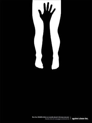
It is a simple advertisement.

Against Abuse Inc - More than 300,000 children are sexually abused in Germany every year.

This advertisement is a true testament to the concept of simplicity being extremely effective. Using only black and white or negative and positive space, the message is delivered without the use of much text. The small writing at the bottom delivers the information, which is necessary for understanding what this graphic represents. However, without even knowing what the text says the graphic alone is effective in grabbing the audience’s eye. Due to it’s alarming nature coupled with the use of such a strong, striking color scheme, the audience is undoubtedly drawn to the graphic.
By creating an image out of space and color it might not even be that the whole image is seen at first, but rather just the black hand or white legs, followed by it’s compliment to make up the whole image. I believe it is even more effective that the shapes do not take up the whole space but rather subtly rest on the top half of the page. Even the choice of font used at the bottom doesn’t provide a sense of urgency or competition with the graphic, it is inconspicuous yet factual and provides the audience just with the necessary information, no frills. I found this advertisement to be extremely effective on many levels, but most importantly from a design perspective in that less can convincingly be more.

Saturday, March 7, 2009

Monday, March 2, 2009

It is an art show!

I tweaked one of my four final logo designs to come up with a new variation that is seen in my newspaper 'Art Show' advertisement:


Reworked advertisement for better newsprint publication:


Final, revised advertisement after class critique:

My revisions included setting a uniform, sans serif font for the informational text and rearranging the objects for better flow. I think this updated version, which does not include unnecessary objects, overall works better.


Wednesday, February 25, 2009

It is my redesigned logo.


My final, stylized logo was meant to give Cicero-North Syracuse's existing logo a new look. Of the four I designed in Illustrator I chose to complete this particular logo because it most closely represented what they considered important, the high school initials. I decided to give my design a more concise look by rounding the corners of the stars to emulate the curves of the text. Overall I think the new design is more polished looking than their existing logo, which appears almost too harsh to be representing a high school.

It is logolicious.

I chose my boyfriend's high school as the foundation for my logo project. Cicero-North Syracuse is located in Syracuse, New York and is "Home Of The Northstars." Their school colors are blue and green, even more specifically, cobalt blue and a slight variation of turquoise. The logos found on their website seemed quite outdated and unconventional, which is why I chose this school over any of my own previous schools.

Their existing logos:


My sketched ideas:

Developed ideas created in Illustrator:


Thursday, February 19, 2009

It is a metaphor.


Vector image created in Illustrator to metaphorically explain the elements used in composing a graphic.

Monday, February 16, 2009

It is a wine I would drink.


For this week's critique I chose to observe packaging particularly on an item of food/drink. I think it is extremely important to consider the promotion of an item of consumption maybe even more so than other every day objects. I can certainly attest to the notion of being visually attracted to an unknown item that weighs heavily upon my decision to purchase said particular item. Specifically when choosing a bottle of wine, considering I am not well versed in the vast culture of what is considered a "good" wine or even what pairs well with a given meal. The most intriguing aspect I look for when shopping for wine is which bottle has the most appealing label, which I find to be a natural instinct. That is why I have chosen this bottle among the many I came across online, it is certainly one I would pull off the shelf for my own consumption.
This label is set off nicely against a black bottle which I'm sure denotes the night sky, which allows the physical elements of the bottle to be pulled together in this very simple aspect. The white and silver text repeats this element of elegance through a very mature typeface as seen on the wrapper and the silver color is seen again at the top of the bottle and on bottom of the label which acts as a pleasing weight for your eyes to rest on. It separates the label from the bottle and allows the important text (name and type of wine, description) to stand out from the rest. The celestial image reinforces the name of the wine, Celeste, in a very determined manner which is known by the brightest star hanging right above the most pronounced word. The placement of the image carefully envelopes the text which allows an appropriate use of proximity to be present. The silver color scheme acts as a representation of fantasy or stars, it's contrast against the darker colors certainly draw attention to the bottle. Overall I think this label and bottle is very successful in marketing a probably luxurious wine in a fairly simple manner.

It is my revised self portrait.


I took into consideration the ideas given to me during our critique and added more "doodles", rearranged the layout and finely edited a few exisiting elements to complete my final self portrait.

Wednesday, February 11, 2009

It is my self portrait.


February 11, 2009.
Original.

Monday, February 9, 2009

It is an artist's self portrait.


Julie Heffernan
Self Portrait as Post Script
2007

Julie Heffernan is an American artist currently living in New York City although by looking at her paintings one may certainly think otherwise. Her lavish figurative and still life work echoes the style of a 17th century artist but provide very modern context in the delicate details that her paintings possess. Much of her work symbolizes a combination of contemporary issues such as feminism, gender issues and motherhood. She is probably most well known for her self portrait series, all of which are said not meant to be literal self-portraits but rather “vehicles to examine memory and to tell a story about the life of the mind, imagination and myth.” In an interview with Insight Online Heffernan said, "...but I don't drive or steer the work to any particular outcome. For me, it's about tracking these pictures in my head that I derive out of a process called image streaming." Her work is extracted from a very psychological locality that gives greater meaning to what each painting as a whole represents. "Before I'm actually sleeping, as I relax and get out of the conscious mind, pictures will flood into my head, kind of like a movie," Heffernan also stated in the interview. This approach to her work is clearly depicted in the subject matter, technique and composition of each piece.

Self Portrait as Post Script clearly encompasses Julie Heffernan’s overall achievement as one of today’s truly unique working artists. It defines her uncommon approach to the common subject matter in a style that seems somewhat forgotten in our society. This image in particular is quite enchanting and I must agree with critics that have called her work “downright haunting.” The black background provides an even darker feel for the already obscure subject matter of a large dress fashioned out of dead animals. However, these elements work together in providing continuity for the impression of mortality. As a self-portrait, all of these elements represent something to the artist and although I don’t understand the overall meaning of the animals, I think they add an even greater depth to the artist’s intention. The flowers accommodate the continuity of natural elements found in this scene, they add feminism and also aesthetically act as a good example of repetition. I think the palette of colors used was very appropriate and certainly add to the feel of darkness that I believe she was trying to convey. Unfortunately I was unable to find detailed information about the artist’s life but what little I did discover about her work and approach to her art seems to hold true in this painting. I am very intrigued by her style and can relate to her definition of a self-portrait, that it should encompass elements that make up and define the self, which she has interestingly done here.

Tuesday, February 3, 2009

It is an unfortunate self portrait.


Perhaps I should revise my 2009 resolution list and add in there "learn how to draw." Yes, I think so.

Sunday, February 1, 2009

It is Tim Walker.


I thought it may be appropriate to base this weeks critique on a photograph as we have just finished up our unit on photoshop. In trying to decide what kind of photograph would best be discussed, a few fashion photographers came to mind. I wanted to find an image that spoke graphically and also portrayed the concepts we spoke about in class. Many fashion photographers create images that display all of these design qualities with the added advantage of beautiful people as their subjects. My chosen image comes from London-based fashion photographer Tim Walker which, however, doesn't fit the image of a beautiful model but rather a striking subject of a purple horse. While the majority of his work stems from the fashion industry and does incorporate people/models, all of his work possesses the same high end, detail oriented, romantic feel which I think even this image represents. It is very simple in that is merely a horse standing in front of a wall of flowers, but the use of colors creates an entirely new persona for the subject. The forceful purple horse is toned down by it's complimentary color green which is used as the backdrop. The rule of thirds applies outstandingly to the ground on which the subject is standing, it allows your eye to rest on the subject without denying any sense of space. The flowers present an added element of surrealism and extravagance while still keeping the overall image quite simple. I think this is a very basic example of Walker's work, it still possesses a high grade of quality but works quite well even as a stand alone image. I'm most fond of the overall eccentricness, it's quirkiness speaks loudly to me...but perhaps I'm just naturally drawn to the weird.

Check out more of Tim Walker's work.

Thursday, January 29, 2009

It is my first wacom sketch.


Sketch of Corey's profile, unfinished.

It is a photo essay.

My photo essay consists of four images depicting things I do in my daily life:

1. Brush my teeth.


2. Make tea.


3. Wash dishes.


4. Sleep.


I chose to edit the images with a thematically mundane color scheme. This was meant to represent the monotony that every day life can sometimes present. To acheive this overall feel, individual colors were desaturated while others were enhanced using curves and levels. Each image has a slightly varied, particular color scheme that I thought was appropriate for the subject. Not too much cropping was necessary in any of the images, however some were slightly rotated and better aligned for a more concise composition. I think part of what adds to the darker tone of these images is the vignetting I applied. While it is much stronger on the image of the bed as opposed to the toothbrush, even the slight darkness around the edges gives the photograph a somewhat dark, trapped feel. This was done through two methods; burning the edges with a large, soft brush and selecting the image with a heavy feathered circle, inverting the selection and decreasing the black point in curves. Although these photographs could perhaps survive as individual shots, I think the edited images are much stronger when grouped together and speak together through their melancholy coloration.