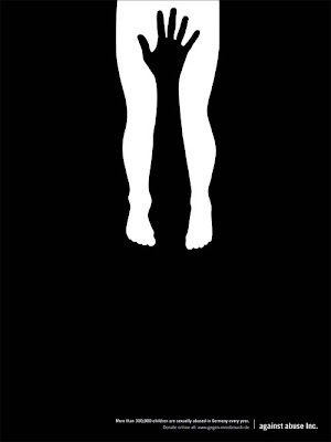
 Against Abuse Inc - More than 300,000 children are sexually abused in Germany every year.
This advertisement is a true testament to the concept of simplicity being extremely effective. Using only black and white or negative and positive space, the message is delivered without the use of much text. The small writing at the bottom delivers the information, which is necessary for understanding what this graphic represents. However, without even knowing what the text says the graphic alone is effective in grabbing the audience’s eye. Due to it’s alarming nature coupled with the use of such a strong, striking color scheme, the audience is undoubtedly drawn to the graphic.
By creating an image out of space and color it might not even be that the whole image is seen at first, but rather just the black hand or white legs, followed by it’s compliment to make up the whole image. I believe it is even more effective that the shapes do not take up the whole space but rather subtly rest on the top half of the page. Even the choice of font used at the bottom doesn’t provide a sense of urgency or competition with the graphic, it is inconspicuous yet factual and provides the audience just with the necessary information, no frills. I found this advertisement to be extremely effective on many levels, but most importantly from a design perspective in that less can convincingly be more.

No comments:
Post a Comment